Before the lockdown
In my sport school there are hand trigger sprayers to clean the machines. So I dutifully clean the machine before and after use. This way my chance on an encounter with a virus is decreased.
There are more machines than the number of hand trigger sprayers. I frequently look for a sprayer. This way my chance on an encounter with a virus is increased.
In order to maintain a distance of 1.5 meters to other people special paths have been marked with arrows. If there is not enough space to pass each other, then the path is a one-way path.
So what is the problem?
When I was a test coordinator for performance tests, I asked for instructions for the testers. I specifically asked for click paths. It boils down to:
- What does the user see?
- What does she or he click?
- What does she or he enter?
- Go back to the first bullet, unless you performed the last action.
A click path is a pattern. This way a performance tester can turn a program into an expert user. It can be compared with the marked path in my sport school. Follow my direction. Nothing wrong with that.
A design pattern is a good way of working. There are also anti-patterns, bad ways of working.
In the previous blog post I showed an anti-pattern for Visual Testing. In this blog post I will show, how a design pattern turns into an anti-pattern. Maybe you will notice it. Of course I will show a way how to avoid it.
Using a click path
Disclaimer: I am not paid by Applitools for writing this article.
For a fast demo I based my code on the Java code on
https://applitools.com/docs/topics/overview/walkthough-example.html#Building
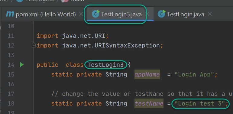
I used the source code TestLogin3.java and pom.xml from this repo. Notice the name of the class and the test.
For this occasion I used the Login application. Again!
I modified the code a bit. Again!
Just imagine that this is an unknown complex website.
So this is my starting point for adding test automation code in the test01 method.
// TODO Add code for Visual Tests.
In order to get a good click path I let an imaginary Subject Matter Expert navigate through the application.
“Just show me what you do.”
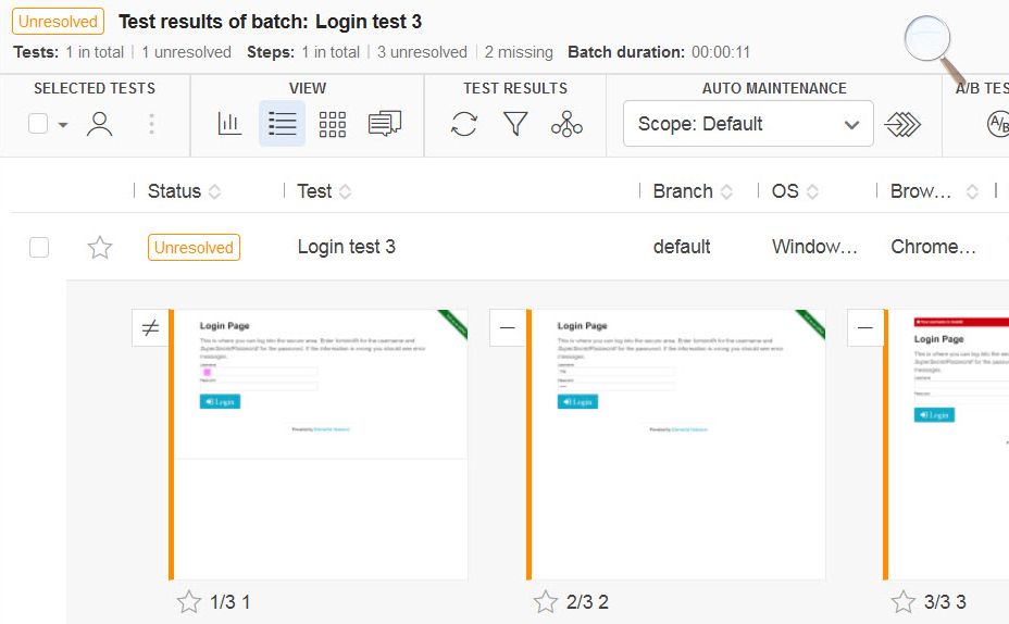
I assumed that I had the faintest idea for the things to come. For the brevity of the blog post I only made 3 visual tests. So I used 3 unique names.
// TODO Add code for Visual Tests.
eyes.checkWindow("1");
eyes.checkWindow("2");
eyes.checkWindow("3");
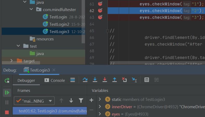
Now I put breakpoints at all the lines with checkWindow.

The next step is to make the first checkpoint for a visual test. So I started to debug.
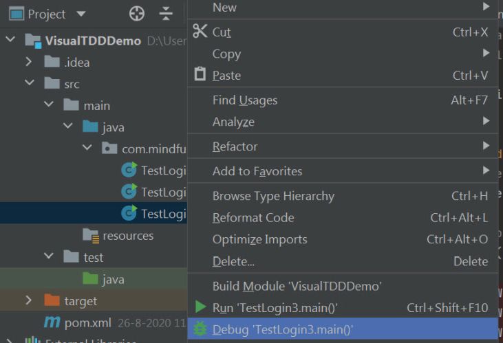
The debugger stopped at the first breakpoint.
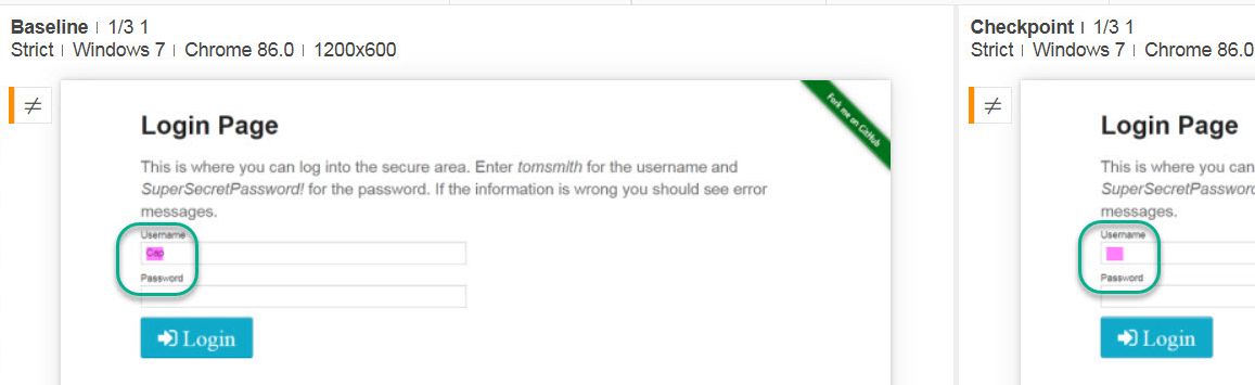
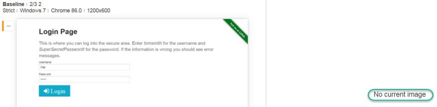
I entered Cap as the user name. Why? Cap can be an abbreviation of Captain Marvel or Captain America.
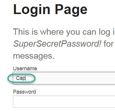
This was the first picture for my click path. Now I resumed the program for the next checkpoint.
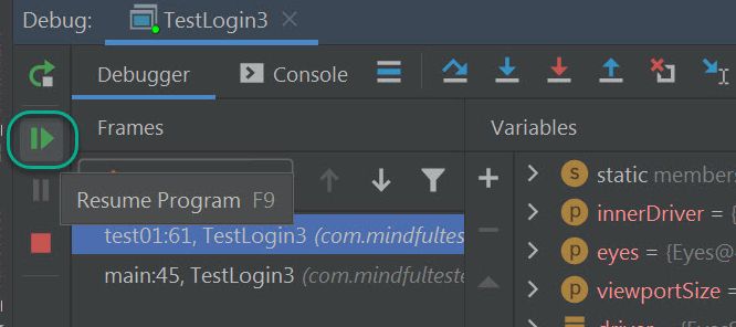
The debugger stopped at the second breakpoint.
This time I entered “Secret” as password.

I had the second picture for my click path. Now I resumed the program for the next checkpoint.
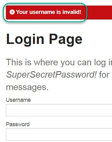
Now it was time to press on the login button. And something went wrong. I mean: some error message was shown.
At that moment three checkpoints had been added:
- username entered
- password entered
- situation after login
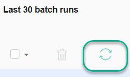
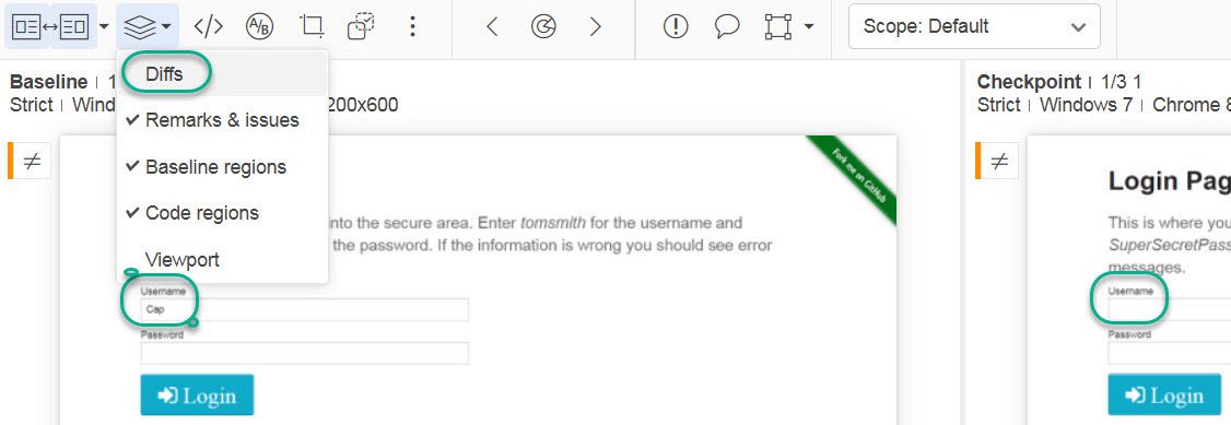
I was more curious about how the checkpoints looked like. I went to the Applitools website for the first time that day. So there was no need to press the Refresh button.
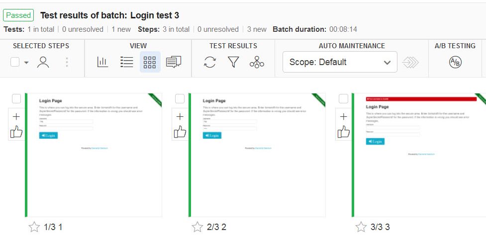
The checkpoints were shown with a green bar. This was the baseline and this was good.
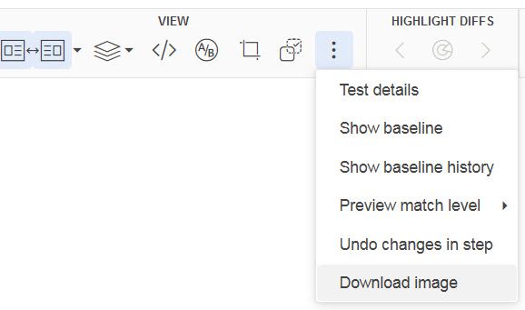
It is even possible to download the picture of the checkpoint.
There was a drawback; actions without visible feedback cannot be captured in the click path with screen prints only. If I made some complex mouse movement, then this was not captured. This is also the case for entering the password.
Now I will do my Red Green Refactor stuff. Starting with
Red: making a failing test.
My first test is determining whether Cap is used as username in the login window is shown.
How could I make it fail? Simple. I had written no code to get to the window and the username, so I had my failing test already in place.
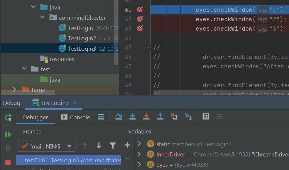
In order to reduce the noise I put the last 2 lines with checkWindow in comment. This way they were not executed. These tests would not pass any way.
eyes.checkWindow("1");
// eyes.checkWindow("2");
// eyes.checkWindow("3");
There was also no need for the breakpoints.
So time to run the program again.
Also time to see the test fail.

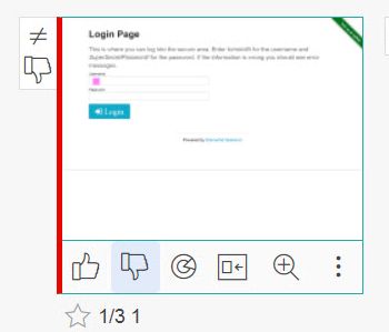
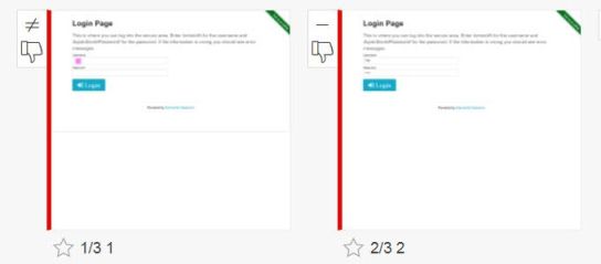
On the Applitools website I pressed the Refresh button to see the last test results.
All were orange. This meant that a human being like me had to determine whether the tests really failed. I like that feature on behalf of humanity.
 A
A
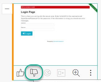
When I looked at the first test, I saw a difference, which was highlighted.
Just to be sure I turned off the highlighting.
This test failed as expected. So I pressed on the thumb down button. The test result turned to red.
Of course I did not write any code, so the second test also failed.
So I pressed the thumb down button for this one.

The second test result truend to red.
But wait, there was a 3rd orange test also waiting for the same thumb movement.
I found a thumb down button under the test result. So there was no need to open the result to press the same button. I love shortcuts like this. Cheers.
And the last test result turned red.
At first I did not expect the last 2 orange results. What happened?
Applitools made a baseline with three checkpoints, which were checked. Even when the check or checkWindow was disabled. So my attempt to reduce noise in my report failed.
Right. Another lesson learned.
After Red it was time for
Green: make enough code to pass the failing test.
This time I added code to the Login window and enter Cap in the username field.
// Go to Login dialog.
driver.get(weburl);

// fill in the username
driver.findElement(By.id("username")).sendKeys("Cap");

eyes.checkWindow("1");
// eyes.checkWindow("2");
// eyes.checkWindow("3");
Time to run the program again.
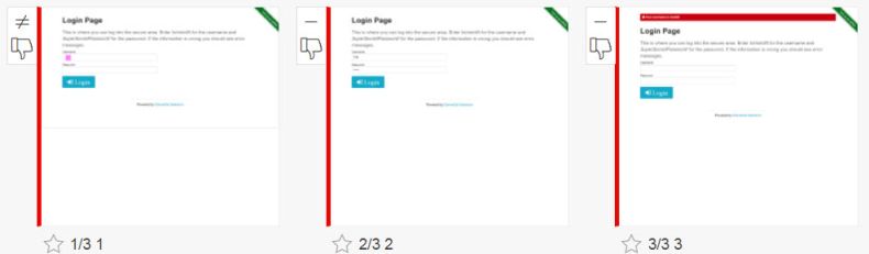
The test failed again.

Another run another press on the Refresh button.
This time I had 1 green and 2 orange test results.
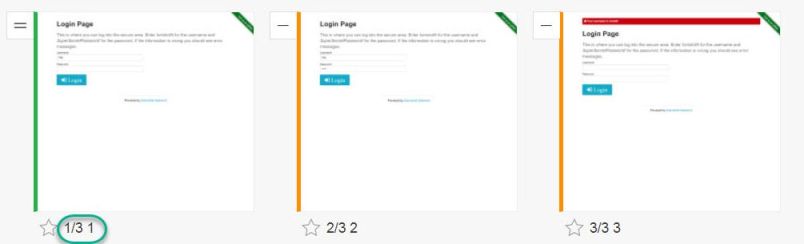
Also notice the text under the first test result with a cryptic text: “1/3 1”. Let me explain this for you. It basically means the 1st out of 3 tests with the name 1.
Now I was able to refactor or cleanup the code. But something went wrong during my exploration of Visual Testing, Test Driven Development, and test automation.
In real life or real business a transaction could include at least 10 visual tests instead of 3 visual tests. So a lot of clicking is to turn other test results to red. But that is a waste of time and energy.
I incidentally made other design errors in my test. Let me illustrate them.
Another imaginary dialogue
Product owner [impatient]: “I want to a brief overview of the test results.”
Amy, the tester: “It went wrong at 1.”
Product owner: “1? What do you mean?”
Amy, the tester: “First step. That means, that the username could not be entered.”
Product owner: “How many times?”
Amy, the tester: “1”.
Product owner [Looking at Brad]: “And you?”
Brad, the tester: “2”.
Product owner: “2 failed tests?”
Brad, the tester: “No. It also went wrong at 1.”
Product owner: “You said too.”
Brad, the tester: “I meant the number 2. The second step is entering the password.”
Product owner: “How many times?”
Brad, the tester: “1”.
Product owner [Looking at Cap]: |What is you score?|
Cap, the tester: “3 1”
Product owner: “Let me guess; third step failed in one test.”
Cap, the tester: “You are right: 3 1.”
Business analyst: [Amused] “Are you still discussing the score of the match of last evening?”
Business analyst: [Curious] “So what were the test results?”
Close problems of the third kind
In the previous chapter we noticed that non descriptive messages are used. 1 is not particular helpful as in checkWindow(“1”).
On a closer look the test01 method is also vague. What is this method about to do? Testing valid credentials or invalid credentials? This is also non descriptive.
Let’s have quick recap of Red Green Refactor:
- Red: make a failing test.
- Green: make enough code to pass the failing test.
- Refactor: clean up the code
The checkWindow method is used for a failing test. There is nothing wrong with that.
At the same time
I used the checkWindow method 3 times in a row. That’s wrong. This way I got Red Red Red for 3 different checkpoints. 2 Reds too many. Then I added a Green Red Red before arriving to my Refactor.
In summary
I used “Red Red Red Green Red Red Refactor” instead of “Red Green Refactor”.
Now changes are appreciated according to the Agile Manifesto.
There is a chance, that the failing test is not up-to-date, when it will be used. At last.
Possible solutions
- Use a separate tool for the click path. Applitools is a test tool and not a logging tool.
- Use a word processor or screen recording tool for describing the click path.
- In case of a screen recording tool, use a word processor to add additional info like password. E.g. type “I will use the password “Secret”.” followed by a copy and paste.
- Add tests as late as possible.
In another blog post I will show how to refactor the created program.