All posts by Mindful tester

Advanced blogging – Honey, I Shrunk The Pictures.

Small recap

It took me three days and three takes to make 26 pictures. Now I had to shrink the pictures to a smaller size. This would lead to a faster download of the blog post and hopefully a better performance of my blog post.

Warning:
This is not the standard look-how-great-I-am blog post. It is more like look-how-I-stumbled-forward.

Reminder to myself:
As a tester I built this website to share information, but also to get a better understanding of building websites. The more I blog, the better I test.

Here, have some notes

Writing a blog post is creating an introduction, a good end, and something in between. The last part was still missing.

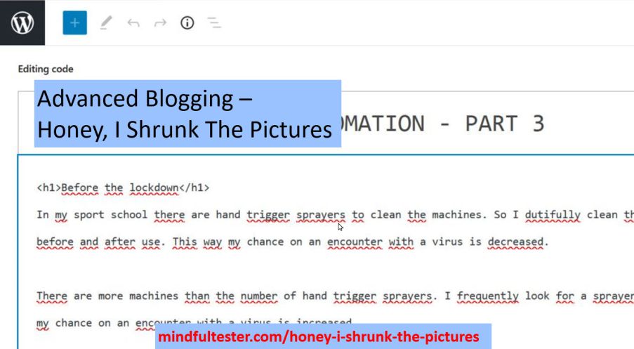
I only had notes and pictures in a charter. As an experienced tester I made my observations including date and time. I used the abbreviation PIC for Picture.

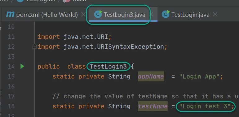
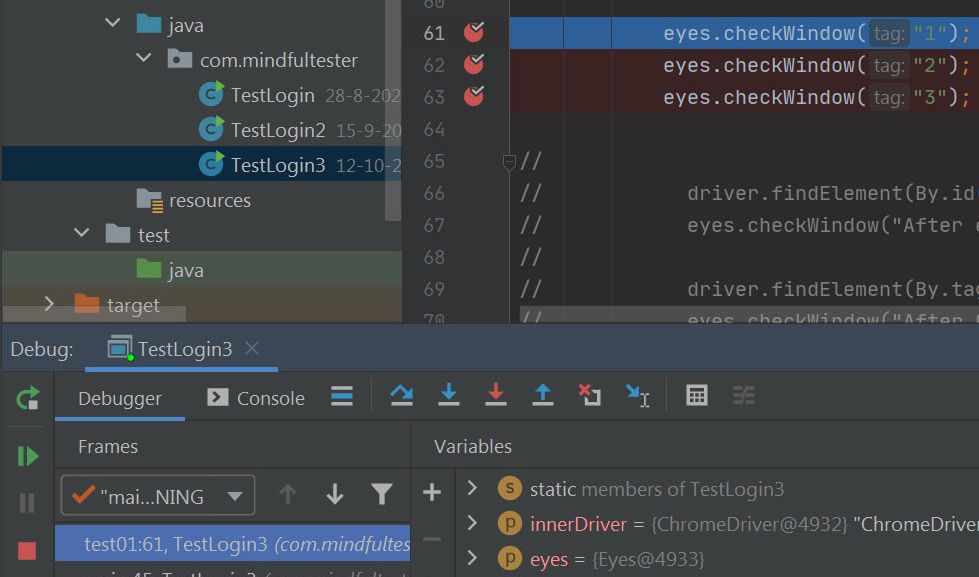
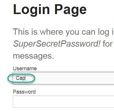
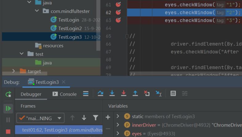
20201012 blogging
PIC 10:37 Screen print TEstLogin3.java 
Input: Cap / Secret.
PIC 10:44 debug menu
PIC 10:46 first breakpoint.
PIC 10:47 Cap in screen.

All my pictures had names like “20201012 – 1.2 debug program.jpg”:

  1. “20201012” is the date when the picture was taken. The format is year in 4 digits, the month in 2 digits, and the day in 2 digits.
  2. “1.2” means Take 1 and Step 2.
  3. “debug program” describes the picture.
  4. “.jpg” describes how the picture is stored. I chose this file format, because it is great for editing. That is a bit of a spoiler.

The big advantage of this name is that I can order the pictures on name.
I must have looked like a Holywood director. Day 1, take 1.

Now I had to make a link between my actions and the pictures. Luckily, I had used descriptive names for the screen pictures. These pictures had a day and time stamp, so it was easy to place the file names at the right places in my blog post.

20201012 blogging
PIC 10:37 Screen print TEstLogin3.java -  20201012 - 1.1 three breakpoints.jpg
Input: Cap / Secret.
PIC 10:44 debug menu - 20201012 - 1.2 debug program.jpg 
PIC 10:46 first breakpoint. - 20201012 - 1.3 - first breakpoint.jpg
PIC 10:47 Cap in screen.- 20201012 - 1.4 - fill in username.jpg

Processing a picture

A 288 kb picture is too big for my blog post. I figured out several steps to cut down the size.

Emphasizing

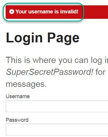
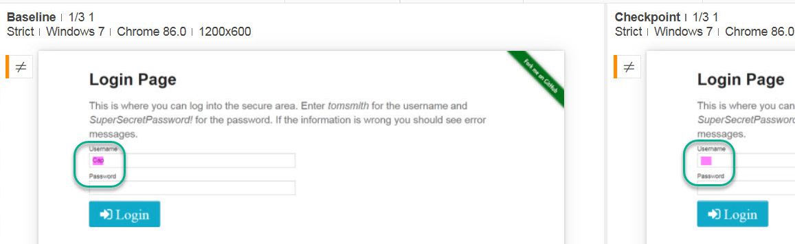
The first step is to determine whether a box should be placed in the picture. If this was the case, I used a green bordered and transparent rounded rectangle for highlighting.I would add “+box”:
e.g. “mindful-tester-p3-20201012 – 1.4 – fill in username+box.jpg”.

Let me break down the name again:

  1. “mindful-tester” is the name of my blog.
  2. “p3” is the third part of TDD in Test Automation.
  3. “20201012” is the date when the picture was taken.
  4. “fill in username” is the description of the picture.
  5. “+box” states that a rectangle is placed in the picture for highlighting an important detail.
  6. “.jpg” describes how the picture is stored.

In case of no box I did not add anything at the end of the name.
This would lead to:
“mindful-tester-p3-20201012 – 1.4 – fill in username+no+box.jpg”
After a while, I did not use the “+no+box” any more, because it did not add value.

I stored the old version of the file in case of any mistakes.
So far, so good.

Zooming in

The second step was that I cropped the picture: I would cut a rectangle out of the picture and save it. My favourite shareware tool is irfanview. Less pixels means smaller size and better performance.

Shrinking

The third step was to shrink the picture also using irfanview.
This way a picture of 288 kb could be shrunk to 40 kb.

In the Resize/Resample image dialog of irfanview the "Set new size as percentage of original" is selected. The Width and Height are set to 100%!

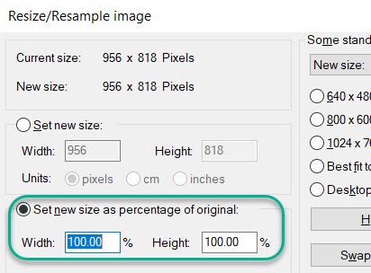
Note: for this blog post I accidentally used a png file. png is like jpg a way to store pictures. Only irfanview would not let me resize the png picture using percentages.

In WordPress I resized the picture to maximum size. I selected a corner of the picture and stretched the picture. This way the user does not have to click on the picture to see the details.

The new file name was:
“mindful-tester-p3-1.4-fill-in-username+box.jpg”.
I left out the date and the spaces in the name.

Was this a joyful experience for me? Not really.
So the time of processing pictures became longer and longer, until I forgot my process.

Processing pictures

The status of the picture was not clear in the file name. Also, the location of the pictures had its own logic. So the time between the editing of one picture and the editing of another picture became longer and longer.

So I made a nice file with all kind of instructions, “Instructions printscreens programming.txt”.
This included files, their contents, and their locations.
Exploratory blogging in a nutshell.

Only to discover that I had already “Overview files.txt” in place.
Exploratory blogging takes practice.

Because a lot of time was spent on editing the pictures, I did not remember my steps well enough while writing. Now pictures are handy, because pictures do not lie. So I had to change my story a few times.

Looking at some pictures I missed the essential point of the picture. So I added the transparent rectangle and went through the whole editing process again. Even after cropping the picture the important details were too small in some cases. So I split pictures in certain cases.

Placing a picture in a blog post is quite tiresome. I had to go to the right location, search the right picture, and upload it. Not enjoyable at all.

But I already knew what I wanted to upload. So I opened Media and uploaded all the pictures using one drag and drop.

Then I searched for the first picture to be included using PIC for Picture. All my files had an unique name like
“mindful-tester-p3-1.4-fill-in-username+box.jpg”.
Using the filter I searched for the file with 1.4 in the name. Then I selected the file.
In the Add media dialog of WordPress the Search Field is set to "1.4". The result of the search is a single picture containing a part of the Login Page!

Uncomfortable observations afterwards

  • At the end I shrunk the total size of my pictures in the blog post to a quarter: from 8 Mb to 2 Mb, which is still big. Is it still possible to shrink the pictures without losing the important details?
  • I did not check the size of my blog post with the preview version.
  • Chrome Devtools contains Lighthouse, an accessibility tool. My site scored 58 on a scale from 1 to 100 for performance. This is not really high.
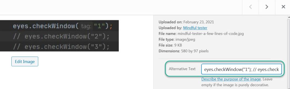
  • The setting of “the most number of blogs posts show on page” was still on 5. I forgot to save this setting. Saving a setting in WordPress was not consistent with saving an alternative text for picture.
  • The trouble with pictures is, that it can cost a lot of time. This will decrease my enjoyability. It makes my blogging slower. On the other hand it will increase the enjoyability of the readers. At the end this will increase my enjoyability. I like to read my own blog posts. I might call this the Enjoyability Paradox. Things which I did, were no fun, but finishing the blog post was good for my mood.

Coming up

At the end of the picture processing, I had a bunch of pictures without alternative texts. For blind people or people with bad sight this had to be fixed. A screen reader needed these texts to describe the pictures aloud. This was about accessibility.

Advanced blogging – Unfamiliar Quality Attributes

What would be a good opening for this blog post?

  1. Content is king!
    Narrator: “It is used so much, that it is boring.” [Sigh]
  2. Meta blogging is blogging about blogging.
    Narrator: “Now you lost me.”
  3. It took Thrisha Gee months to make a good video of 20 minutes. I had screenshots of 20 minutes of testing. Now I fully understood her.
    Narrator: “Tell me more.”

My favourite opening for this post is the last one.
But I am too late. I already started with a rethorical multiple choice question.

Some stats

In the past months I made 2 blog posts with lots of pictures, so I had some experiences how to deal with this case.
This time it was 3 days, 3 takes, and 26 pictures.

Performance

Let me do some calculations. 26 pictures of the screen with a size of 288 kb would make an 8 Mb post. This is not what my readers are waiting for. Downloading!

I was experiementing with the number of posts on my home page and following pages. This would reduce the number of pictures on 1 page significantly. In WordPress it looks like this:
After selecting Settings and Reading there is an option to set blog pages show at most to 3 posts!

The story is, that mobile friendly web sites had a major impact on SEO or Search Engine Optimalisation. If a user can view the website fast enough on his or her mobile, then the search engine will place it high in the list of search results.

Accessibility

For deaf people and people with bad hearing there were no obstacles on my blog. I did not use any movies. Let me describe a scene of a closeup of a face in 3 ways:

  1. No options used.
  2. Undertitles
    [Typing sounds]
    [“What are you typing?”]
    [“I saw something strange.”]
  3. Closed captions
    [Face of a programmer is shown.]
    [Tester is typing on the keyboard]
    [Programmer: What are you typing?”]
    [Tester: “I saw something strange.”]

If I will add a movie, then I really like to use the closed captions.

In the past I used cursive font, but this is bad for people who are visually impaired or have a bad view. So I stopped using it.

I even increased the contrast of my quotes.

This is a quote with a good contrast.

For programming dark mode is quite convenient for visually impaired people. White characters on a black background are more readable than black characters on a white background.

Blind and visually impaired peoplemight  have or might have problems with text in a picture. An image cannot be read aloud by a screen reader. I could add an alternative text to the image.
The visible part of the alternative text of a picture of 3 lines of codes with 2 comments is: "eyes.checkWindow("1");// eyes.check"!

The screen reader could read it aloud, but the whole structure of the code would be gone. Several lines of code are spoken as a single line of code. This is confusing.

eyes.checkWindow("1");// eyes.checkWindow("2");// eyes.checkWindow("3");

could be interpreted as:

eyes.checkWindow("1");
// 
eyes.checkWindow("2");
// 
eyes.checkWindow("3");

So I used the pre tag of HTML to display the code in a proper way using the code editor:

<pre>eyes.checkWindow("1");
// eyes.checkWindow("2");
// eyes.checkWindow("3");
</pre>

Now I had to find an efficient way to include 26 pictures  with alternative texts for a single blog post.

Enjoyability

My target audience was programmers who know the basics of Java and an IDE or Integrated Development Environment.
I also counted on the fact that they had the tools properly installed. This is described in other places.

For me a story is more enjoyable to review than a set of instructions. This spreadsheet blog post contains a set of boring instructions.

It was a challenge to stop myself to turn the new blog post into a set of pictures. Another way of boring.

Was there a way to add some humour to it?

Coming up

In the next blog post I will focus on reducing the size of the blog post.

Visual TDD in Test Automation – part 3

Before the lockdown

In my sport school there are hand trigger sprayers to clean the machines. So I dutifully clean the machine before and after use. This way my chance on an encounter with a virus is decreased.

There are more machines than the number of hand trigger sprayers. I frequently look for a sprayer. This way my chance on an encounter with a virus is increased.

In order to maintain a distance of 1.5 meters to other people special paths have been marked with arrows. If there is not enough space to pass each other, then the path is a one-way path.

So what is the problem?

When I was a test coordinator for performance tests, I asked for instructions for the testers. I specifically asked for click paths. It boils down to:

  • What does the user see?
  • What does she or he click?
  • What does she or he enter?
  • Go back to the first bullet, unless you performed the last action.

A click path is a pattern. This way a performance tester can turn a program into an expert user. It can be compared with the marked path in my sport school. Follow my direction. Nothing wrong with that.

A design pattern is a good way of working. There are also anti-patterns, bad ways of working.

In the previous blog post I showed an anti-pattern for Visual Testing. In this blog post I will show, how a design pattern turns into an anti-pattern. Maybe you will notice it. Of course I will show a way how to avoid it.

Using a click path

Disclaimer: I am not paid by Applitools for writing this article.

For a fast demo I based my code on the Java code on
https://applitools.com/docs/topics/overview/walkthough-example.html#Building

I used the source code TestLogin3.java and pom.xml from this repo. Notice the name of the class and the test.

For this occasion I used the Login application. Again!
I modified the code a bit. Again!
The source code of TestLogin3.java is shown with the TestLogin3 class and test name "Login test 3"

Just imagine that this is an unknown complex website.

So this is my starting point for adding test automation code in the test01 method.

// TODO Add code for Visual Tests.

In order to get a good click path I let an imaginary Subject Matter Expert navigate through the application.
“Just show me what you do.”

I assumed that I had the faintest idea for the things to come. For the brevity of the blog post I only made 3 visual tests. So I used 3 unique names.

// TODO Add code for Visual Tests.
eyes.checkWindow("1");
eyes.checkWindow("2");
eyes.checkWindow("3");

Now I put breakpoints at all the lines with checkWindow.
There are three lines with checkWindow and a red dot indicating that that there is a breakpoint!

The next step is to make the first checkpoint for a visual test. So I started to debug.
The Context Menu or right click menu of TestLogin3.java is opened and the Debug TestLogin3 is selected!

The debugger stopped at the first breakpoint.
The debugger is shown and the line with checkWindow("1") is highlighted!

I entered Cap as the user name. Why? Cap can be an abbreviation of Captain Marvel or Captain America.
The Username field contains "Cap"!
This was the first picture for my click path. Now I resumed the program for the next checkpoint.
The button with the thin green filled rectangle and the green filled triangle pointing to the right is selected showing a menu with the Resume Program option!

The debugger stopped at the second breakpoint.
The debugger is shown and the line with checkWindow("2") is highlighted!

This time I entered “Secret” as password.
The password field contains 6 dots!

I had the second picture for my click path. Now I resumed the program for the next checkpoint.
The button with the thin green filled rectangle and the green filled triangle pointing to the right is selected showing a menu with the Resume Program option!

Now it was time to press on the login button. And something went wrong. I mean: some error message was shown.
An error message is shown, that the username is invalid!
At that moment three checkpoints had been added:

  1. username entered
  2. password entered
  3. situation after login

I was more curious about how the checkpoints looked like. I went to the Applitools website for the first time that day. So there was no need to press the Refresh button.
The Refresh button is a button with two arced arrows!

The checkpoints were shown with a green bar. This was the baseline and this was good.
In the Applitools website the screenshots are shown: 1) only username filled in 2) both username and password are filled in and 3) the one with the error message of the invalid username!

It is even possible to download the picture of the checkpoint.
The menu with the three vertical dots is selected and shows a menu option download image!

There was a drawback; actions without visible feedback cannot be captured in the click path with screen prints only. If I made some complex mouse movement, then this was not captured. This is also the case for entering the password.

Now I will do my Red Green Refactor stuff. Starting with
Red: making a failing test.

My first test is determining whether Cap is used as username in the login window is shown.
How could I make it fail? Simple. I had written no code to get to the window and the username, so I had my failing test already in place.

In order to reduce the noise I put the last 2 lines with checkWindow in comment. This way they were not executed. These tests would not pass any way.

eyes.checkWindow("1");
// eyes.checkWindow("2");
// eyes.checkWindow("3");

There was also no need for the breakpoints.

So time to run the program again.
Testlogin3.java is selected and the right click or context menu is opened followed by the selection of the Run option!

Also time to see the test fail.
An error message is shown, that the test failed. It also contained "matches=0 missing=2 mismathces=1"!

On the Applitools website I pressed the Refresh button to see the last test results.
The Refresh button is a button with two arced arrows!
All were orange. This meant that a human being like me had to determine whether the tests really failed. I like that feature on behalf of humanity.
All three checkpoints has an orange bar at the left!A

When I looked at the first test, I saw a difference, which was highlighted.
Button with two images of a form and a double pointed arrow between them is selected and showing a menu is shown with the Show both option which is checked. In the left image or baseline "Cap" in the username field is hightlighted in pink, in the right image or checkpoint the empty username field is highlighted in pink!

Just to be sure I turned off the highlighting.
In the left image or baseline "Cap" in the username is shown, in the right image or checkpoint the username is empty. In the right upper corner there is a thumb down button!

This test failed as expected. So I pressed on the thumb down button. The test result turned to red.
The checkpoint with the filled in password has a red bar at the left!

Of course I did not write any code, so the second test also failed.
The second checkpoint and a message about no current image is shown!

So I pressed the thumb down button for this one.
A thumb down button is shown on the right!

The second test result truend to red.
In the overview of the test results a thumb down button is shown on the picture of the third test!

But wait, there was a 3rd orange test also waiting for the same thumb movement.

I found a thumb down button under the test result. So there was no need to open the result to press the same button. I love shortcuts like this. Cheers.
A thumb down button is shown under the test result!

And the last test result turned red.
All the test results in the overview have a red bar at the left!

At first I did not expect the last 2 orange results. What happened?
Applitools made a baseline with three checkpoints, which were checked. Even when the check or checkWindow was disabled. So my attempt to reduce noise in my report failed.

Right. Another lesson learned.

After Red it was time for
Green: make enough code to pass the failing test.

This time I added code to the Login window and enter Cap in the username field.

// Go to Login dialog.
driver.get(weburl);

// fill in the username
driver.findElement(By.id("username")).sendKeys("Cap");

eyes.checkWindow("1");
// eyes.checkWindow("2");
// eyes.checkWindow("3");

Time to run the program again.
Testlogin3.java is selected and the right click or context menu is opened followed by the selection of the Run option!
The test failed again.
The following message is shown: "3 steps matches=3 missing=2 mismatches=0"!

Another  run another press on the Refresh button.
The Refresh button is a button with two arced arrows!

This time I had 1 green and 2 orange test results.
The first test result has a green bar to the left and the other ones have a orange bar at the left. Under the first test result "1/3 1" is shown!

Also notice the text under the first test result with a cryptic text: “1/3 1”. Let me explain this for you. It basically means the 1st out of 3 tests with the name 1.

Now I was able to refactor or cleanup the code. But something went wrong during my exploration of Visual Testing, Test Driven Development, and test automation.

In real life or real business a transaction could include at least 10 visual tests instead of 3 visual tests. So a lot of clicking is to turn other test results to red. But that is a waste of time and energy.

I incidentally made other design errors in my test. Let me illustrate them.

Another imaginary dialogue

Product owner [impatient]: “I want to a brief overview of the test results.”
Amy, the tester: “It went wrong at 1.”
Product owner: “1? What do you mean?”
Amy, the tester: “First step. That means, that the username could not be entered.”
Product owner: “How many times?”
Amy, the tester: “1”.
Product owner [Looking at Brad]: “And you?”
Brad, the tester: “2”.
Product owner: “2 failed tests?”
Brad, the tester: “No. It also went wrong at 1.”
Product owner: “You said too.”
Brad, the tester: “I meant the number 2. The second step is entering the password.”
Product owner: “How many times?”
Brad, the tester: “1”.
Product owner [Looking at Cap]: |What is you score?|
Cap, the tester: “3 1”
Product owner: “Let me guess; third step failed in one test.”
Cap, the tester: “You are right: 3 1.”
Business analyst: [Amused] “Are you still discussing the score of the match of last evening?”
Business analyst: [Curious] “So what were the test results?”

Close problems of the third kind

In the previous chapter we noticed that non descriptive messages are used. 1 is not particular helpful as in checkWindow(“1”).

On a closer look the test01 method is also vague. What is this method about to do? Testing valid credentials or invalid credentials? This is also non descriptive.

Let’s have quick recap of Red Green Refactor:

  • Red: make a failing test.
  • Green: make enough code to pass the failing test.
  • Refactor: clean up the code

The checkWindow method is used for a failing test. There is nothing wrong with that.

At the same time
I used the checkWindow method 3 times in a row. That’s wrong. This way I got Red Red Red for 3 different checkpoints. 2 Reds too many. Then I added a Green Red Red before arriving to my Refactor.

In summary
I used “Red Red Red Green Red Red Refactor” instead of “Red Green Refactor”.

Now changes are appreciated according to the Agile Manifesto.
There is a chance, that the failing test is not up-to-date, when it will be used. At last.

Possible solutions

  • Use a separate tool for the click path. Applitools is a test tool and not a logging tool.
  • Use a word processor or screen recording tool for describing the click path.
  • In case of a screen recording tool, use a word processor to add additional info like password. E.g. type “I will use the password “Secret”.” followed by a copy and paste.
  • Add tests as late as possible.

In another blog post I will show how to refactor the created program.