Category Archives: Programming

A Bit More Responsive

Years ago some websites looked terrible on my smartphone. They looked like websites viewed from 6 meters distance.

The first time I visited my blog with my smartphone, I was really anxious: “Does it look right?”

5 seconds later “What did I worry about?”

Disclaimer

I am not a legal expert. So please have a look at my used sources. Or contact a legal expert.

I am just a tester finding test ideas about accessibility. Thanks for joining in advance.

Some test responsiveness stories

My first tablet app to be tested was intended for an iPad. I had a Windows PC instead of the tablet. This was not right.

My solution was to install Safari and let it emulate an iPad. In other words: “I know you are a Windows machine. Now you function like an iPad.”
It sounds like a hypnosis act.
“What did I worry about?”

This work around did not stop me to demand an iPad. There is nothing like the real thing.

Responsive web design is basically about creating the best possible user experience in the assigned space on the screen.

This blog looks good on a mobile device and a laptop. The same features are shown only in a different order and in a different way, but it feels the same. Really responsive.

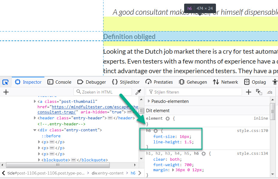
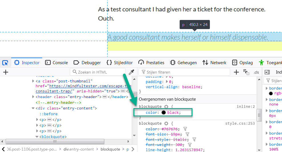
The last years I learned CSS or Cascading Style Sheets. CSS determines how the websites looks. It is even possible to change the locations of web elements.

If I look to this website in a browser on a laptop, I can make the window smaller by resizing the window. The effect is that elements of the web page are resized or relocated or not shown any more.

During a debriefing a developer showed me this resizing trick.
Resize and look for bad things like hidden buttons or partially shown texts.
It is a fast way for the first impression.

Can not install on my machine

All that resizing stuff is not an exact science and Safari … cannot simply be installed on a company laptop because of a company policy. So I did a bit of research. If you don’t mind.

Firefox has a special feature Dev Tools. It can be accessed using the F12 key. In the upper right corner of this sub window there is a button with two rectangles, which look like a smartphone and a tablet.
A green eclipse marking a button with a smartphone and a tablet in the menu bar of Dev Tools!

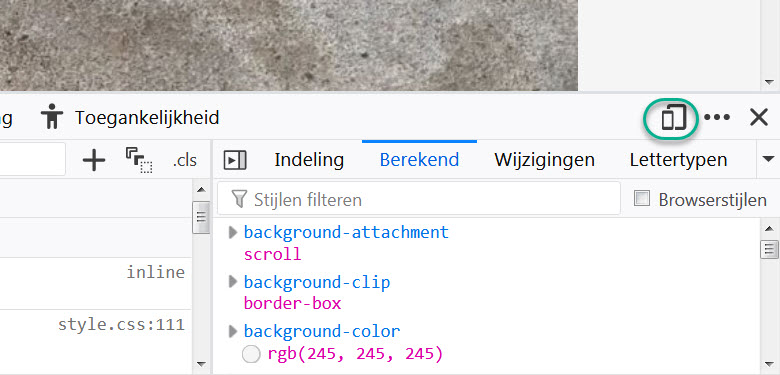
This opens a lot of options to test smartphones and tablets.

It also support the screen orientation like portrait and landscape.

Just look to this website on a mobile phone while holding it in portrait mode. Then change it to landscape. In portrait mode only the headers of my last blog posts are shown, in the landscape mode the last complete blogs posts are shown. Courtesy of my website software.

Chrome and Edge also have Dev Tools which can be accessed using F12 key. Both Dev Tools windows have an emulator tab for mobile devices.

Concerning responsiveness

One of the biggest search engines decided to give a higher ranking to mobile friendly websites. So support for small screens can give a positive boost to let a user find a website.

Most people have a PC or laptop with 1 screen. It is sometimes tedious to switch application. So I tend to resize the applications to fit more of them on my screen. My preference is squeezed and usable.

Another thing for responsiveness is language. Some customers prefer to use a website or application in their own language. OK is translated to OK, but Cancel to Annuleren or Annullieren. So the button should be resized after translation.

Responsiveness is not only about reshuffling web page elements. It is also about resizing the web page elements in case of bigger fonts.

Suppose I have bad eyes, then I need to make fonts bigger so that I can actually read the text. Pressing the Ctrl key and the + key at the same time will enlarge the text in browsers and Windows applications.

Problem solved?
No, I am so sorry.

As a user I have to scroll a lot. It is like watching a picture which is split over three different screens. I have to change my seat to get the whole picture.

In 2024 this could have some legal consequences in Europe.
In Annex 1 of the European Accessibility Act “flexible magnification” is mandatory for specific commercial websites.

In case of American customers for an e-commerce website there is a law already in place at this very moment. Americans with Disabilities Act (ADA) explicitly points to  the WCAG or Web Content Accessibility Guidelines on page 196 of Americans with Disabilities Act Title III Regulations.

In WCAG  also attention must be paid to screen size and orientation.

One more chat

“How would you like your website?”
“Responsive please.”
“No problem.”
“Thank you, my dear.”
“You are welcome, grandma.”

Link Missing In Action

“Know the ways of all professions”
– Miyamoto Musashi

UX designer

A few blog posts ago I told about my attempts to make this very blog more accessible. I just walked my talk.

For people who need a story:
As a user with no or bad view I want headers tagged as headers, so that the screen reader can read the headers differently aloud.

Web master

I changed the look of the headers in a lot of blog posts. I went in a flow and gained more speed in the process, until …

A small square disappeared. I just did an undo and continued editing.

The next time I let the square disappear, I had already updated the blog post on the web.

Hit the OK, Jack.
[on the melaody of “Hit the road, Jack”]

This was not good for my user journey. I did not want to lose a user by a missing link. Just stick around.

Tester

There was an easy trick for finding missing links. On the internet there were free websites and add ons for browsers available.

Marketeer

As a marketeer I had some problems with broken link reporters. A reporter had to hit every page and every link in it. So the number of hits would increase significantly.

Even worse there are web pages referring to other web pages. So some pages are counted double. Then there are categories and months referring to pages. So some pages are counted more than twice.

This would hide the real traffic in my daily reports. But this is not a company web site. Otherwise I should have to add a note about a maintenance period. For an auditor. So I could skip this role.

Tester again

First pick of a broken link service stopped half way. The second looked promising, but it had terms and conditions.

Legal expert

Now I was curious. I clicked on the link and landed on a page with lots of legal sentences. Must be American thing.

I tried to distil the information. The most important message was that the service was provided as is. There were no financial consequences for the service providers.

I have a website which does not provide me any income.
So what was I waiting for?

Enter my website and show my broken links you can find.

Author

Now it was the turn for the author to have a fix.
Yeah. Sure.

The first broken link was ejc2008.de. This is short for European Juggling Convention 2008 in Germany. More than 10 years ago. This must be an old-timer.

I entered the URL in the browser and got an error message. After 10 years the website was taken offline. But I needed a link.

Then I looked for internet archive wayback machine in my search engine. This website stores all versions of visited websites. I entered ejc2008.de and found my website.

I picked a link to 2019 copy and replaced the link in the blog posts. This way people can still read about a convention which was visited by more than 3,000 people sharing the fun of juggling.

In my list of broken links I found a link to a Let’s Test conference in 2015. I had a better link available, so I just updated the link. A similar situation for the first TestBash conference in the Netherlands.

It was a simple test tool. No need to switch to tester mode.

Another run of broken link test revealed that I had not changed the About me page. Why did they show up now? No idea.
Anyways. Fixed.

3rd test run revealed no more missing links. But something was wrong. I missed the comeback of the square. Popping back in view.

Web master again

In my memory I tried to locate the square. It was during header 6 handling. Then I remembered the use of anchors.

An anchor is a fast way to get a reader at the right place in a blog post instead of the top of the post. This saves the reader some scrolling. Example time.

In my blog post about a test exercise the following code is shown in my code editor:

My last upload before my workshop was for me <a href="http://mindfultester.com/a-look-behind-the-scenes/#disaster">another exercise in exploration</a>.

In my blog post “A look behind the scenes – in Runö” the following code is shown in my code editor:

<h1><strong><a id="disaster"></a>Flirting with disaster</strong></h1>

A broken link checker only checks whether the link exists and ignores the presence of an anchor. So it was an anchor missing in action.

Now I had to check the 90ish blog posts for anchors. Preferably automatically and not clicking all links myself. Please.

If I could only find them. I got a flash of insight. It was possible to find blog posts with a search engine in my Content Management System or website authoring program.

I looked for #. And yes, all blog posts with anchors and links with anchors were listed. Now it was easy to add missing anchors.

Professions

So I was

  • Tester
  • Marketeer
  • Legal expert
  • UX designer
  • Author
  • Web master

I skipped the auditor though.

Tweaking My Blog Accessibility

Accessibility is something which is within my reach. It just took me some years to use it properly.

If you are in a hurry, just go to the Accessibility Tips. If you have more time, you can start with the next paragraph. Next.

Sleight of thought

For my blog I use a default WordPress theme. I try to compensate this standard look and feel with humour. Am I kidding? No.

My first blog post was a struggle with looks. I did not like header 1. The font was too big. I just used bold to make the headers. That looked just right.

During an online computer course I had my first encounter with a screen reader. Users with bad or no view can use this program to read a web page aloud.

My trick for nice headers using bold was backfiring: a screen reader would not recognise them as headers. I really needed some header tag. So I ended up with header 6. This looked good, but it was still not right.

Just a little more

After tensome blogs I started to use the alternative text of the image.

In the attachment details of the pciture the location of the Alt text has been marked!!
In the past this was primarily used for people with slow internet connection. This way they still could get an impression of the webpage, when the text was shown.

In another online course I learned that the screen reader could use this for the communication. Then I read a tweet about using a proper description. So “another mindmap” was not really helpful.

Now I had to compress the information in a picture in a few sentences. That was really tricky, if some graph was involved.
A line graph is shown with three different colours: orange for beginners, green for proficient, and blue for expert. There is a green circle "Skill IQ 135" in the green line, which is connectd to a vertical line with "40th percentile" at the foot!"
The Alt text is as follows:
“A line graph is shown with three different colours: orange for beginners, green for proficient, and blue for expert. There is a green circle “Skill IQ 135” in the green line, which is connected to a vertical line with “40th percentile” at the foot!”

Maybe you noticed the exclamation mark or ! at the end of the text. This is a trick I learned later one: the screen reader reads this text differently aloud.

I even made a blog post with a few screen reader tricks. In this particular post a screen reader user has a big advantage over a user using a normal view.

More exploration from my side

The trick with header 6 was not right. I just knew. A lot of people start counting from 1, programmers from 0. But 6 is not the right exception.

It was a matter of months that I read about a confused screen reader. So I better start from header 1. Which was not my big favourite.

On Twitter I saw a tweet of a user with a bad view complaining about bad contrast. Within minutes another blogger reacted by adjusting his website.

My turn

I did quick check of my blog. It was all black characters on a white background. Then I noticed that my quotes were vague.

Now I had to find a way to change my headers and quotes. Time to explore the Content Management System or software to maintain my blog. Mine is called WordPress.

I first focused on the desired look of my header. I opened my word processor for note taking. My goal was to have my header 1 to look like header 6.

There was a nice tool in my browser: Dev Tools or Developer Tools. In my browser on my Windows machine I pressed F12, scrolled down to a header, selected the element, and saw the properties.

After the selection of header 6 in the upper window the properties of this element are shown in the right bottom window!

I did the same sequence for the quote. In HTML it is called blockquote. Fine with me.

The colour was grayish. I started to play with all kinds of colour codes. Until I realised that “black” was also good description for a font colour.

Dev Tools allowed me to experiment with the properties of the block quote without an intimidating program.

The color of the bloack quote has temporarily been changed to black!

Easy does it.

Now I had two pieces of code. Somewhere I had to fit them in. I started touring the CMS or Content Management System and found Additional CSS using the following path
Dashboard => Appearance => Customize => Additional CSS.

CSS stands for Cascading Style Sheets. Suppose I change the look of header 1 at 1 place. It will affect the look of all headers 1 in my whole blog. Cascading is cool.

I was too early for claiming my victory. Header 1 did not change in the visual editor. I did a preview and it looked right. Okay, found something.

In the left window Header 1 is shown in the Visual Eidotr, in the right window header 1 is shown in the preview!

At the end I had changed all headers 6 to headers 1.
So I only had to modify all the headers of my remaining blog posts. Great. Extra work.

The change of colour in the block quote went smoothly. But I was not pleased with the vertical alignment of the quote. It was too close to the left margin.

On the web I discovered that margin of an object was used to place a rectangle around the quote. Another search led to padding. If I could pad the text in the quote, then it would shift to the right. Left padding was enough.

Additional Css contains: "blockquote { 	color: black; 	padding-left: 5%; }  h1 {     font-size: 16px;     line-height: 1.5; } "!

Because I had only used block quotes for quotes, all quotes in my blog were automatically modified.

Accessibility tips

  • Use header to mark headers instead of making them bold.
  • Add an alternative text ending with an exclamation mark to all pictures.
  • Make the contrast of the colours of the text and background bigger instead of using some gray colour on a white background.
  • Use Additional CSS in WordPress, if you are still not pleased with the look of the elements on the page.
  • Look for other ideas on the Global Accessibility Awareness Day website. For the record it is the third Thursday of May every year.GAAD almost encircled by a powercard attached to a keyboard!

Ending notes

  • I know that there are enough readers willing to check the accessibility of my blog. The status of accessibility on my blog is in progress.
  • At the moment of publishing this post there are still words in bold who look like headers in my first blog posts. There are still pictures without an alternative text and/ or exclamation mark.
  • I would not be surprised that there is still work to be done after all these updates.