Category Archives: Accessibility

Advanced blogging – Unfamiliar Quality Attributes

What would be a good opening for this blog post?

  1. Content is king!
    Narrator: “It is used so much, that it is boring.” [Sigh]
  2. Meta blogging is blogging about blogging.
    Narrator: “Now you lost me.”
  3. It took Thrisha Gee months to make a good video of 20 minutes. I had screenshots of 20 minutes of testing. Now I fully understood her.
    Narrator: “Tell me more.”

My favourite opening for this post is the last one.
But I am too late. I already started with a rethorical multiple choice question.

Some stats

In the past months I made 2 blog posts with lots of pictures, so I had some experiences how to deal with this case.
This time it was 3 days, 3 takes, and 26 pictures.

Performance

Let me do some calculations. 26 pictures of the screen with a size of 288 kb would make an 8 Mb post. This is not what my readers are waiting for. Downloading!

I was experiementing with the number of posts on my home page and following pages. This would reduce the number of pictures on 1 page significantly. In WordPress it looks like this:
After selecting Settings and Reading there is an option to set blog pages show at most to 3 posts!

The story is, that mobile friendly web sites had a major impact on SEO or Search Engine Optimalisation. If a user can view the website fast enough on his or her mobile, then the search engine will place it high in the list of search results.

Accessibility

For deaf people and people with bad hearing there were no obstacles on my blog. I did not use any movies. Let me describe a scene of a closeup of a face in 3 ways:

  1. No options used.
  2. Undertitles
    [Typing sounds]
    [“What are you typing?”]
    [“I saw something strange.”]
  3. Closed captions
    [Face of a programmer is shown.]
    [Tester is typing on the keyboard]
    [Programmer: What are you typing?”]
    [Tester: “I saw something strange.”]

If I will add a movie, then I really like to use the closed captions.

In the past I used cursive font, but this is bad for people who are visually impaired or have a bad view. So I stopped using it.

I even increased the contrast of my quotes.

This is a quote with a good contrast.

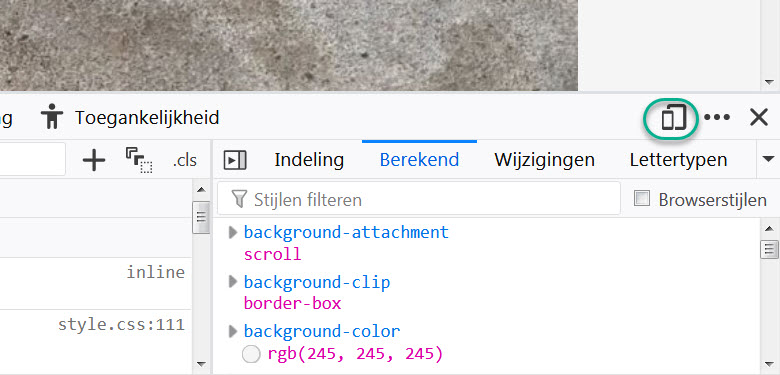
For programming dark mode is quite convenient for visually impaired people. White characters on a black background are more readable than black characters on a white background.

Blind and visually impaired peoplemight  have or might have problems with text in a picture. An image cannot be read aloud by a screen reader. I could add an alternative text to the image.
The visible part of the alternative text of a picture of 3 lines of codes with 2 comments is: "eyes.checkWindow("1");// eyes.check"!

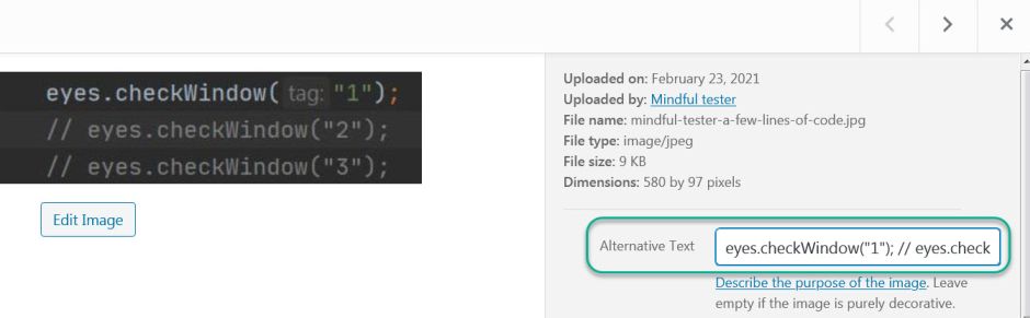
The screen reader could read it aloud, but the whole structure of the code would be gone. Several lines of code are spoken as a single line of code. This is confusing.

eyes.checkWindow("1");// eyes.checkWindow("2");// eyes.checkWindow("3");

could be interpreted as:

eyes.checkWindow("1");
// 
eyes.checkWindow("2");
// 
eyes.checkWindow("3");

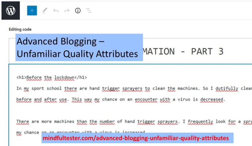
So I used the pre tag of HTML to display the code in a proper way using the code editor:

<pre>eyes.checkWindow("1");
// eyes.checkWindow("2");
// eyes.checkWindow("3");
</pre>

Now I had to find an efficient way to include 26 pictures  with alternative texts for a single blog post.

Enjoyability

My target audience was programmers who know the basics of Java and an IDE or Integrated Development Environment.
I also counted on the fact that they had the tools properly installed. This is described in other places.

For me a story is more enjoyable to review than a set of instructions. This spreadsheet blog post contains a set of boring instructions.

It was a challenge to stop myself to turn the new blog post into a set of pictures. Another way of boring.

Was there a way to add some humour to it?

Coming up

In the next blog post I will focus on reducing the size of the blog post.

Tweaking My Workshop Accessibility

During the Speakers Dinner of Agile Testing Days 2019 I told Abby Bangser about my attempts to make my workshop accessible.
“It is even possible to add alternative text to images in PowerPoint. If you click on the image, there are several tabs. One tab contains Alternative text. [ … ]

Don’t forget the exclamation mark (!). The screen reader will read it differently.”

Tobias Geyer, another speaker, was confused. I saw him thinking: “Alternative to what?”
I told him about a screen reader which could read information aloud to people. This is handy for people with a visual impairment. Alternative text is used on web sites to add more information to pictures.

If the presentation would be downloadable at the beginning of the presentation, then attendees would be able to hear the information on the slides.

Blind review

Some people state that a blind review is the best one. The reviewer is not distracted by the looks of the speaker or the beauty of the pictures.

One of my reviewers was blind, so I really needed to speak well. Without the use of my slides it was difficult to tell a story. The main feedback was no clear structure.

So I added a mind map which gave a proper view of the workshop. This was really appreciated by the next reviewer.

For the exercises I had already tested the website with a screen reader. Once again it was time for the real thing.

My blind reviewer went through the website without any delay. The reading speed was so high, that it looked like a normal person was skimming the webpages. The feedback was almost instantaneous.

It was strange for me to hear, that bugs were found by clicking around. Navigation was on hearing. My test website passed the accessibility test.

Sound advice

The Friday before Agile Testing Days I had a talk with someone with a bad hearing. I told about my workshop. How should I speak to people who cannot hear well?

“What would be your best advice?”
“Ask whether people can hear you.
It is a professional thing you can do:
“Can you hear me?”

What also helpful is, are pictures. Next to key words on the slides.” This way a talk could be reconstructed, if words would be missed.

Somehow I lost sight on my slides.

I told about the handheld microphones seen on one of the pictures. Most of the time I put it in front of my mouth.
“It can be lowered. The quality will not decrease much, but people are able to see your mouth.” Lip reading for the win.

In the days before the workshop I focused on big fonts on my slides and my cards. I increased the contrast between the text and the background.

What could go wrong?

What went wrong?

I completely forgot to ask the audience whether they could hear me. Where was my checklist?
I had none.
Oh.

The most embarrassing part of the downloadable stuff was, that there were no files on the promised location at the start of my workshop.
Big oops from my side.

After this painful discovery I repeated all the steps: I went to my github and uploaded my presentation. This time I scrolled down. A commit button?! I forgot to press it.

Github is git in the cloud. It can be used to store different versions of files. I still wrestle with it. As Janet Gregory stated in her talk it is about deliberate practice. I had only practiced once. In my case I had cut one corner too many.

Days after my workshop I checked the alternative text in the pdf file of my presentation on my laptop. I double clicked the file and the file was opened in my browser.

The text of the slide was told aloud by the screen reader. I hovered above a picture. Not a sound. I was also silent.

Last weekend I did another attempt to get some sound of a picture. I double clicked the file on my PC and Acrobat reader opened the file.

I searched a picture and placed my mouse pointer on it. A hover text was shown and read aloud. That’s what I liked to hear.

So Acrobat reader can handle alternative text of pictures, but my favourite browser not. And I had not made Acrobat reader a requisite for the workshop. A bit late, but alternative text can be used.

What went right?

I maximised pictures. Leaving out irrelevant parts from the slides.

In the right top corner of the slides I used small pictures to show the state of the test session.

During my preparation I looked at the presentation. There were no spots shining on the screen, so the contrast was good.

During the demo part I used a headset microphone. Attendees could hear me and I could talk at a normal volume. Most important is the fact, that the small microphone did not hide my mouth.

A Bit More Responsive

Years ago some websites looked terrible on my smartphone. They looked like websites viewed from 6 meters distance.

The first time I visited my blog with my smartphone, I was really anxious: “Does it look right?”

5 seconds later “What did I worry about?”

Disclaimer

I am not a legal expert. So please have a look at my used sources. Or contact a legal expert.

I am just a tester finding test ideas about accessibility. Thanks for joining in advance.

Some test responsiveness stories

My first tablet app to be tested was intended for an iPad. I had a Windows PC instead of the tablet. This was not right.

My solution was to install Safari and let it emulate an iPad. In other words: “I know you are a Windows machine. Now you function like an iPad.”
It sounds like a hypnosis act.
“What did I worry about?”

This work around did not stop me to demand an iPad. There is nothing like the real thing.

Responsive web design is basically about creating the best possible user experience in the assigned space on the screen.

This blog looks good on a mobile device and a laptop. The same features are shown only in a different order and in a different way, but it feels the same. Really responsive.

The last years I learned CSS or Cascading Style Sheets. CSS determines how the websites looks. It is even possible to change the locations of web elements.

If I look to this website in a browser on a laptop, I can make the window smaller by resizing the window. The effect is that elements of the web page are resized or relocated or not shown any more.

During a debriefing a developer showed me this resizing trick.
Resize and look for bad things like hidden buttons or partially shown texts.
It is a fast way for the first impression.

Can not install on my machine

All that resizing stuff is not an exact science and Safari … cannot simply be installed on a company laptop because of a company policy. So I did a bit of research. If you don’t mind.

Firefox has a special feature Dev Tools. It can be accessed using the F12 key. In the upper right corner of this sub window there is a button with two rectangles, which look like a smartphone and a tablet.
A green eclipse marking a button with a smartphone and a tablet in the menu bar of Dev Tools!

This opens a lot of options to test smartphones and tablets.

It also support the screen orientation like portrait and landscape.

Just look to this website on a mobile phone while holding it in portrait mode. Then change it to landscape. In portrait mode only the headers of my last blog posts are shown, in the landscape mode the last complete blogs posts are shown. Courtesy of my website software.

Chrome and Edge also have Dev Tools which can be accessed using F12 key. Both Dev Tools windows have an emulator tab for mobile devices.

Concerning responsiveness

One of the biggest search engines decided to give a higher ranking to mobile friendly websites. So support for small screens can give a positive boost to let a user find a website.

Most people have a PC or laptop with 1 screen. It is sometimes tedious to switch application. So I tend to resize the applications to fit more of them on my screen. My preference is squeezed and usable.

Another thing for responsiveness is language. Some customers prefer to use a website or application in their own language. OK is translated to OK, but Cancel to Annuleren or Annullieren. So the button should be resized after translation.

Responsiveness is not only about reshuffling web page elements. It is also about resizing the web page elements in case of bigger fonts.

Suppose I have bad eyes, then I need to make fonts bigger so that I can actually read the text. Pressing the Ctrl key and the + key at the same time will enlarge the text in browsers and Windows applications.

Problem solved?
No, I am so sorry.

As a user I have to scroll a lot. It is like watching a picture which is split over three different screens. I have to change my seat to get the whole picture.

In 2024 this could have some legal consequences in Europe.
In Annex 1 of the European Accessibility Act “flexible magnification” is mandatory for specific commercial websites.

In case of American customers for an e-commerce website there is a law already in place at this very moment. Americans with Disabilities Act (ADA) explicitly points to  the WCAG or Web Content Accessibility Guidelines on page 196 of Americans with Disabilities Act Title III Regulations.

In WCAG  also attention must be paid to screen size and orientation.

One more chat

“How would you like your website?”
“Responsive please.”
“No problem.”
“Thank you, my dear.”
“You are welcome, grandma.”